


“Ilse kept asking what a founder would need to know before writing to us. The site now puts our focus, partners and companies together in a way that helps someone judge whether we're the right fit.”
A venture fund website that helps founders judge the fit.

For a founder, a fund's website is part of deciding whom to approach. Broad language about backing ambitious companies says little about the team's interests, experience or working style.
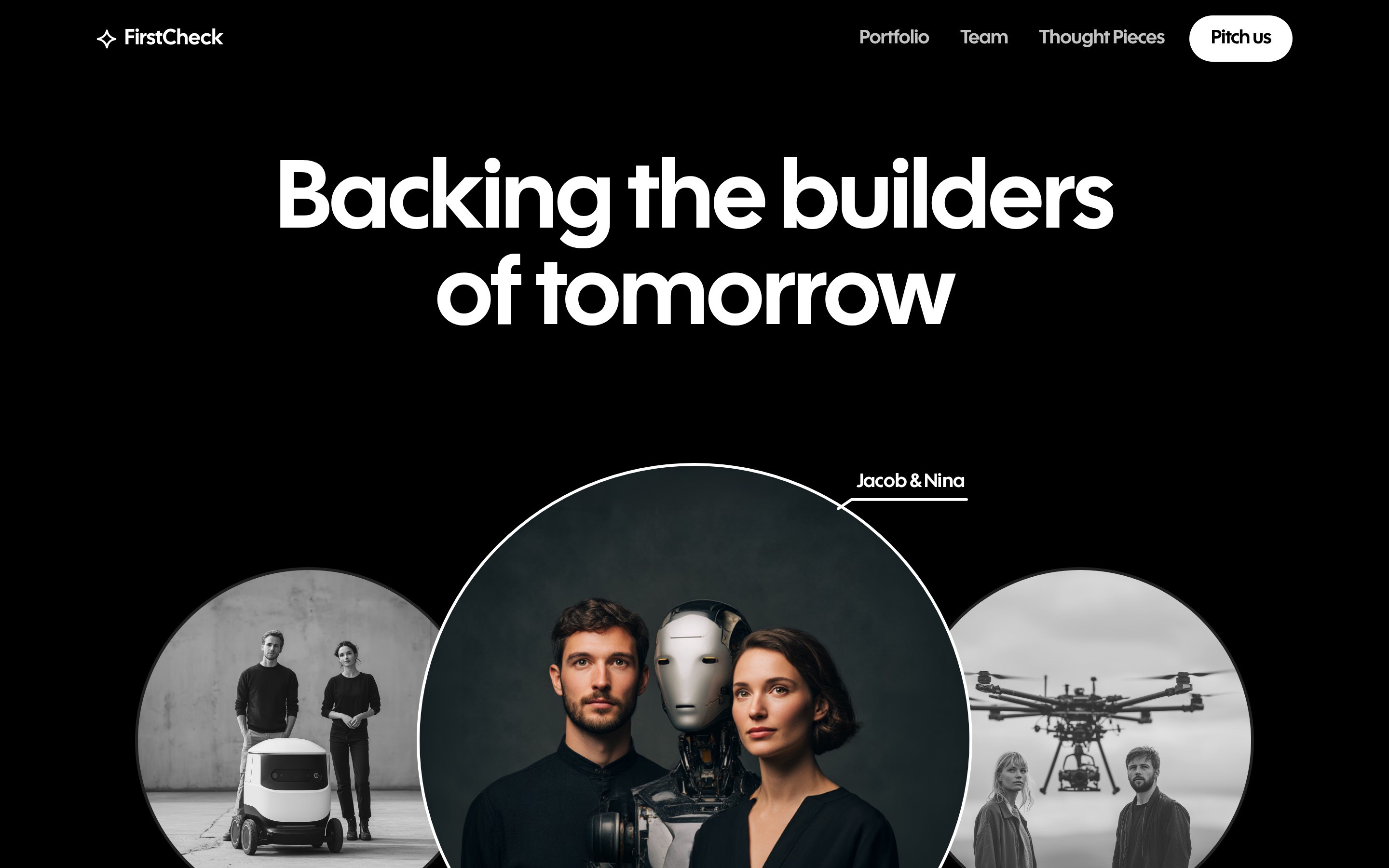
FirstCheck needed to make its investment focus and people visible, while giving portfolio companies a place of their own rather than treating them as a logo strip.
I gave the site a direct opening, supported by founder imagery and a clear invitation to pitch. The dark ground and compact typography keep the emphasis on people, companies and the fund's perspective.
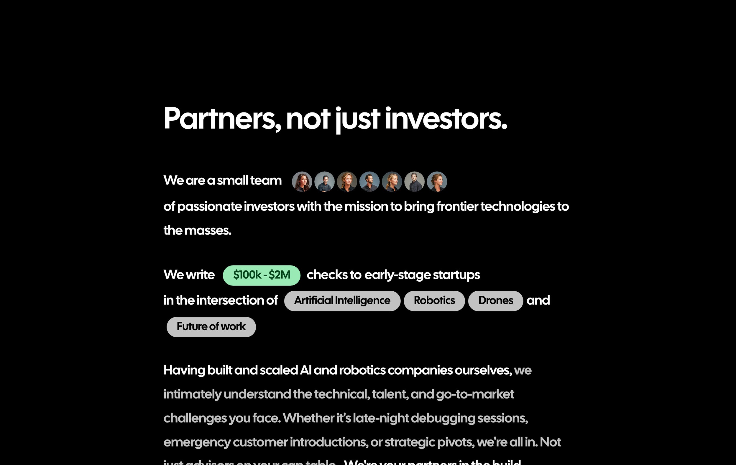
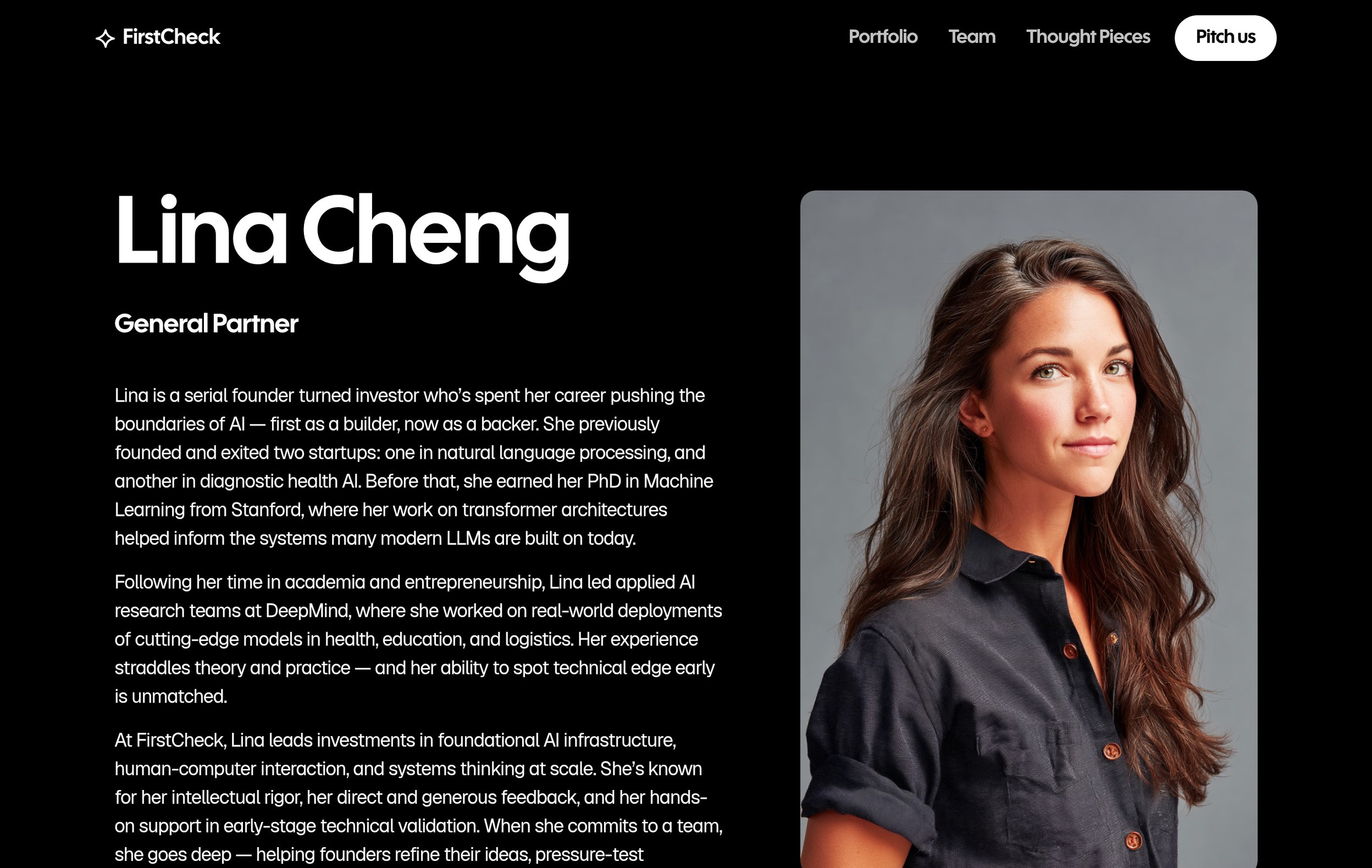
The partner section states the investment range and areas of interest in a readable sentence. Individual profiles make the team easier to understand. Portfolio cards then bring each company forward with an image, a category and a short description.
Thought Pieces gives the fund room to explain how it sees the sectors it invests in. The portfolio, team and editorial pages use repeatable structures, so new companies and writing can join the site without redesigning the page.
The finished site gives a founder several ways to assess fit before sending a pitch: the stated focus, the companies already backed, the people involved and the team's writing.
Those parts share one visual system, with a mobile layout that keeps the pitch route close and the company stories readable.
Three ways for a founder to understand the fund before making an introduction.
Paper, FramerFrom the final designs.


“Ilse kept asking what a founder would need to know before writing to us. The site now puts our focus, partners and companies together in a way that helps someone judge whether we're the right fit.”
Other sites and brands from the last year.
Tell me what you’re working on. I reply within two working days.