Jess HarlowProduct lead, Nonlinear
✓ Approved“Ilse organized the story around the way a week works. The screens do the explaining, and the page gives each feature a job. It feels connected to the product we are building.”
👏 6🗓️ 2on Nonlinear
 Weelume
Showing how a team's calendar can become its working surface.
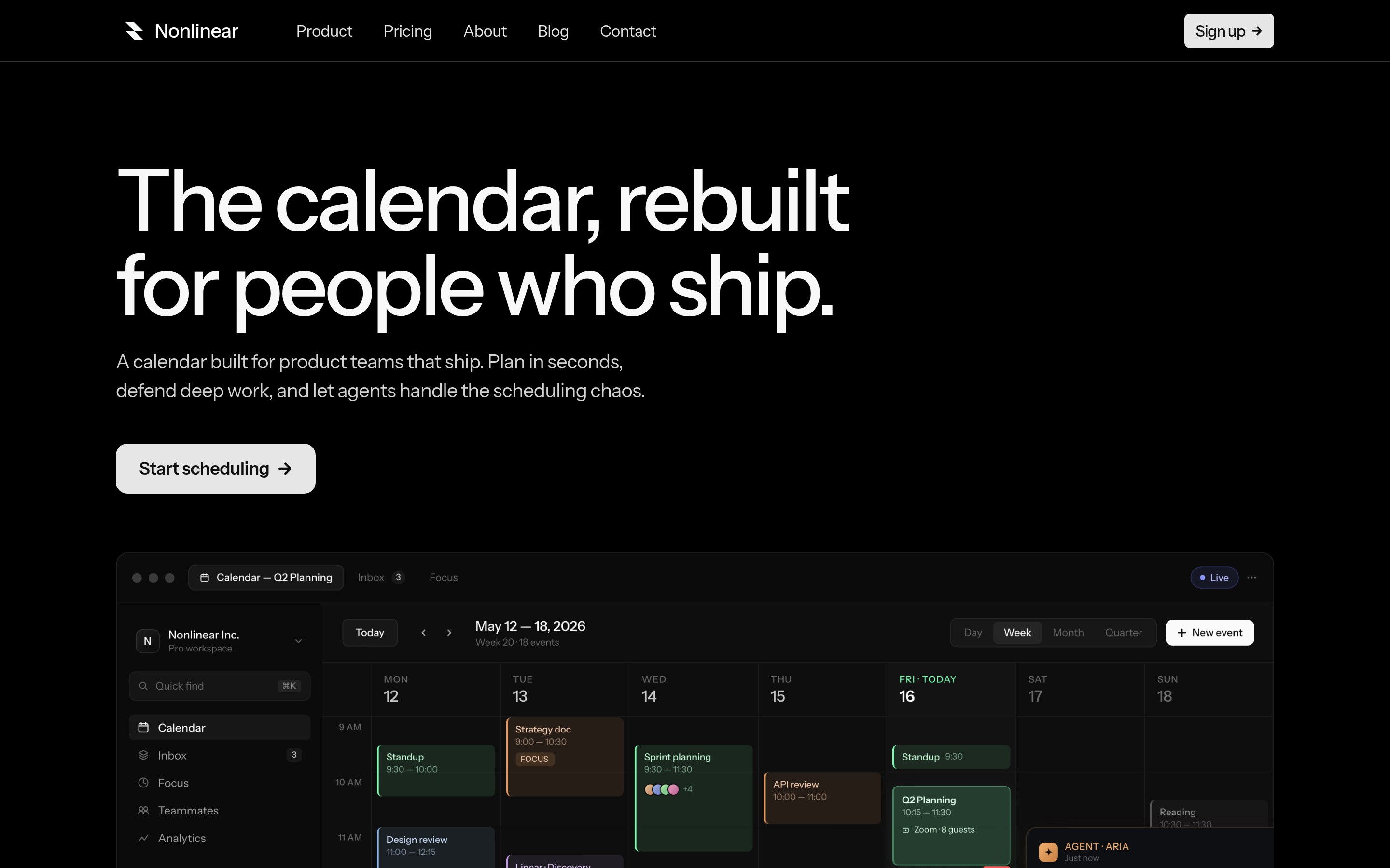
A calendar product has to earn its place beside tools people already know. Scheduling, planning, focus time and AI assistance can become a long list of features with no clear picture of a working day.
Nonlinear needed to explain how those pieces belong together and make the product interface the evidence for that explanation.
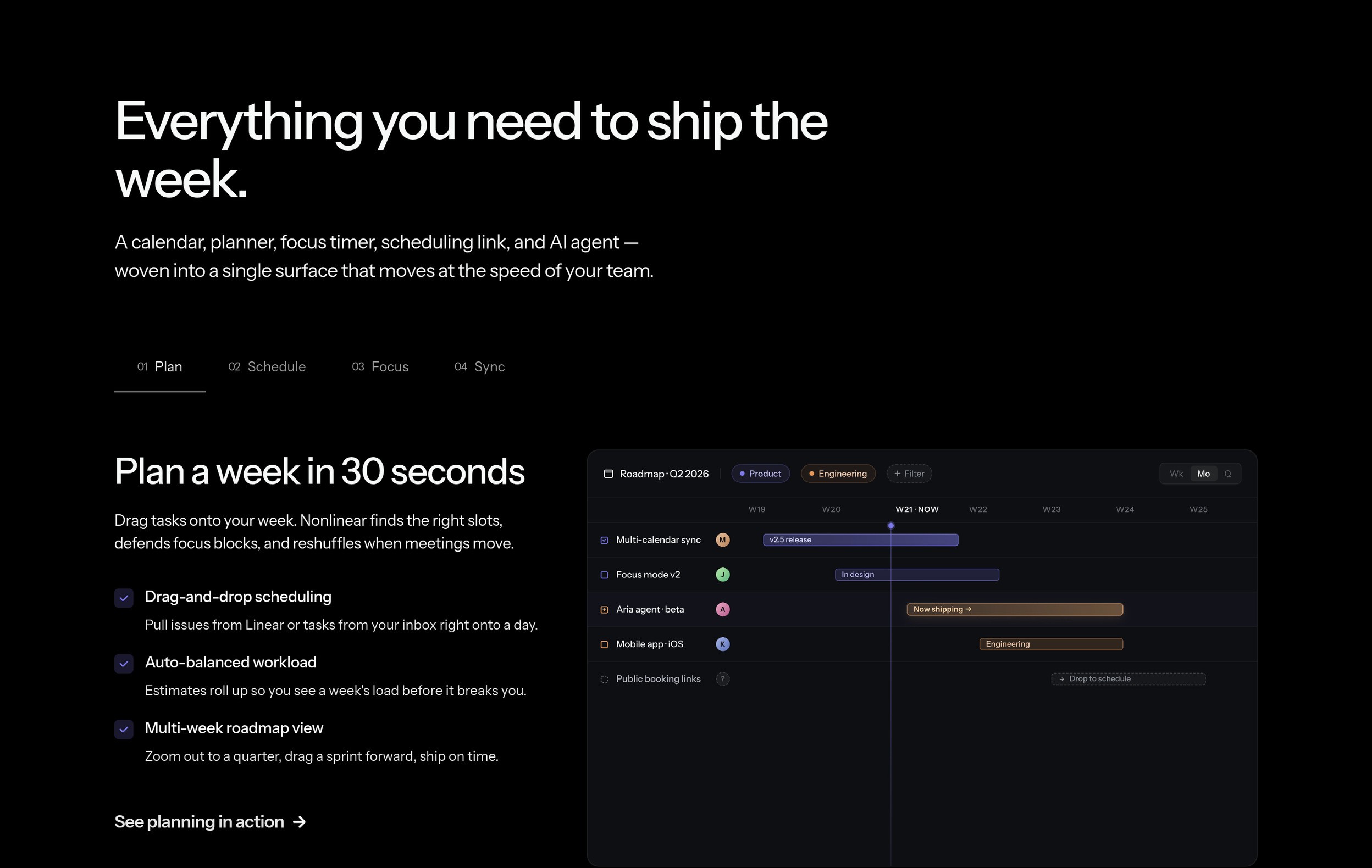
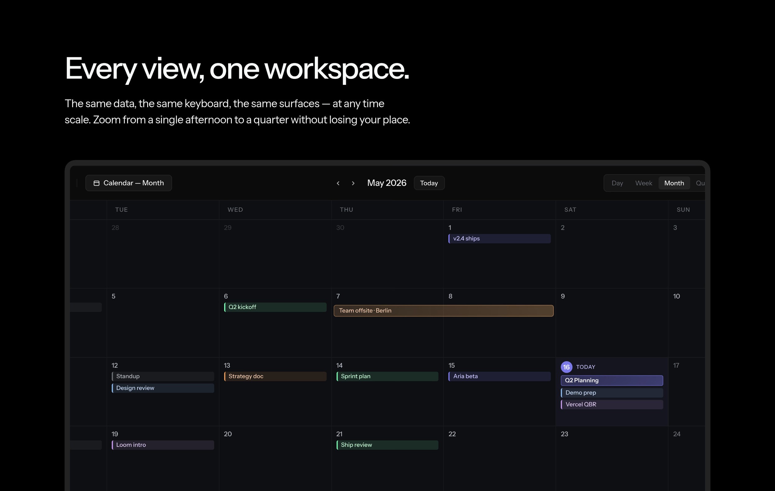
I led with the calendar itself. Product screens carry the story against a dark, quiet background, while the headings describe the job each screen helps someone do.
The feature section groups the product around planning, scheduling, focus and synchronization. Different calendar views show the same working context at different scales. The visual treatment follows the interface—small color accents, restrained borders and clear hierarchy—so the marketing page feels connected to the product.
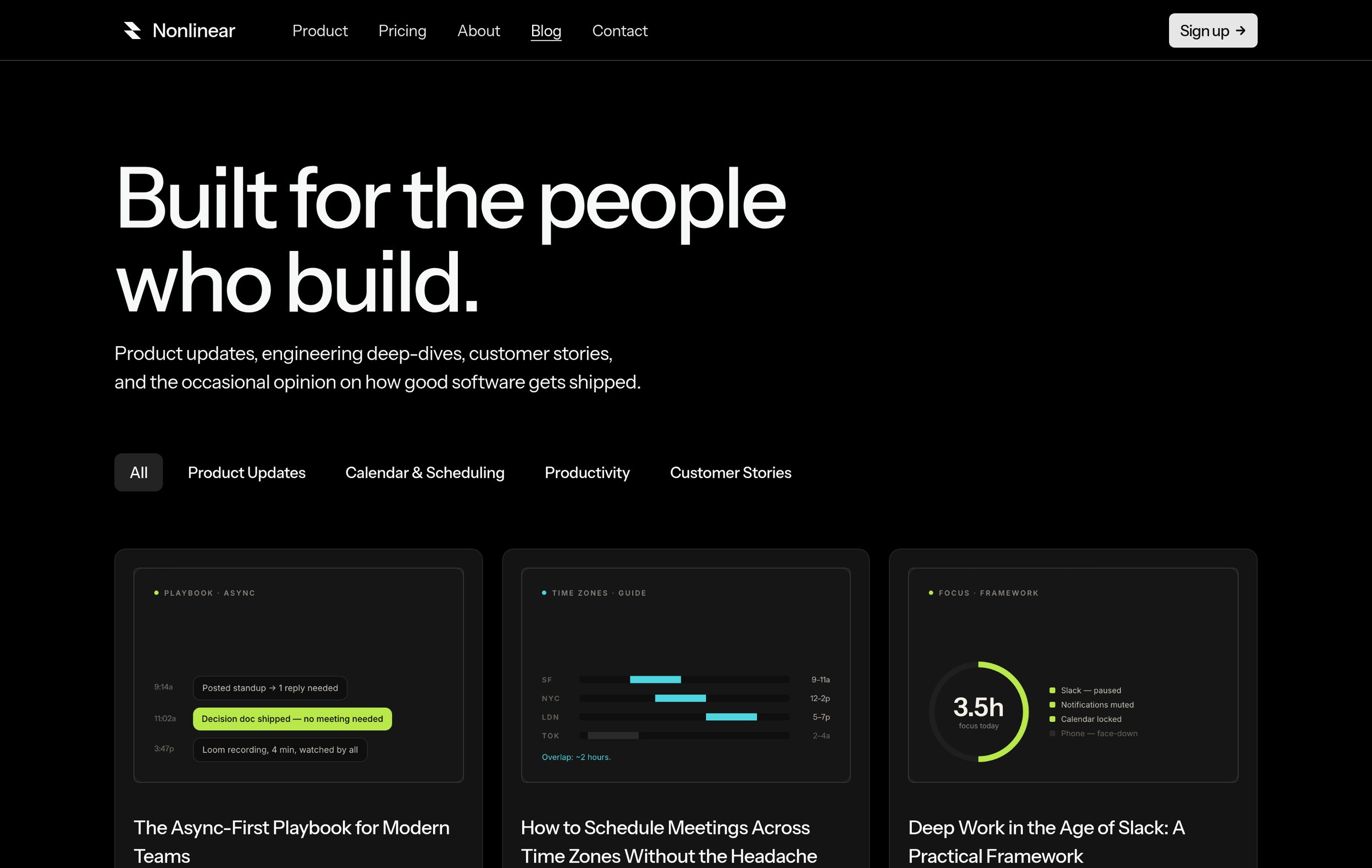
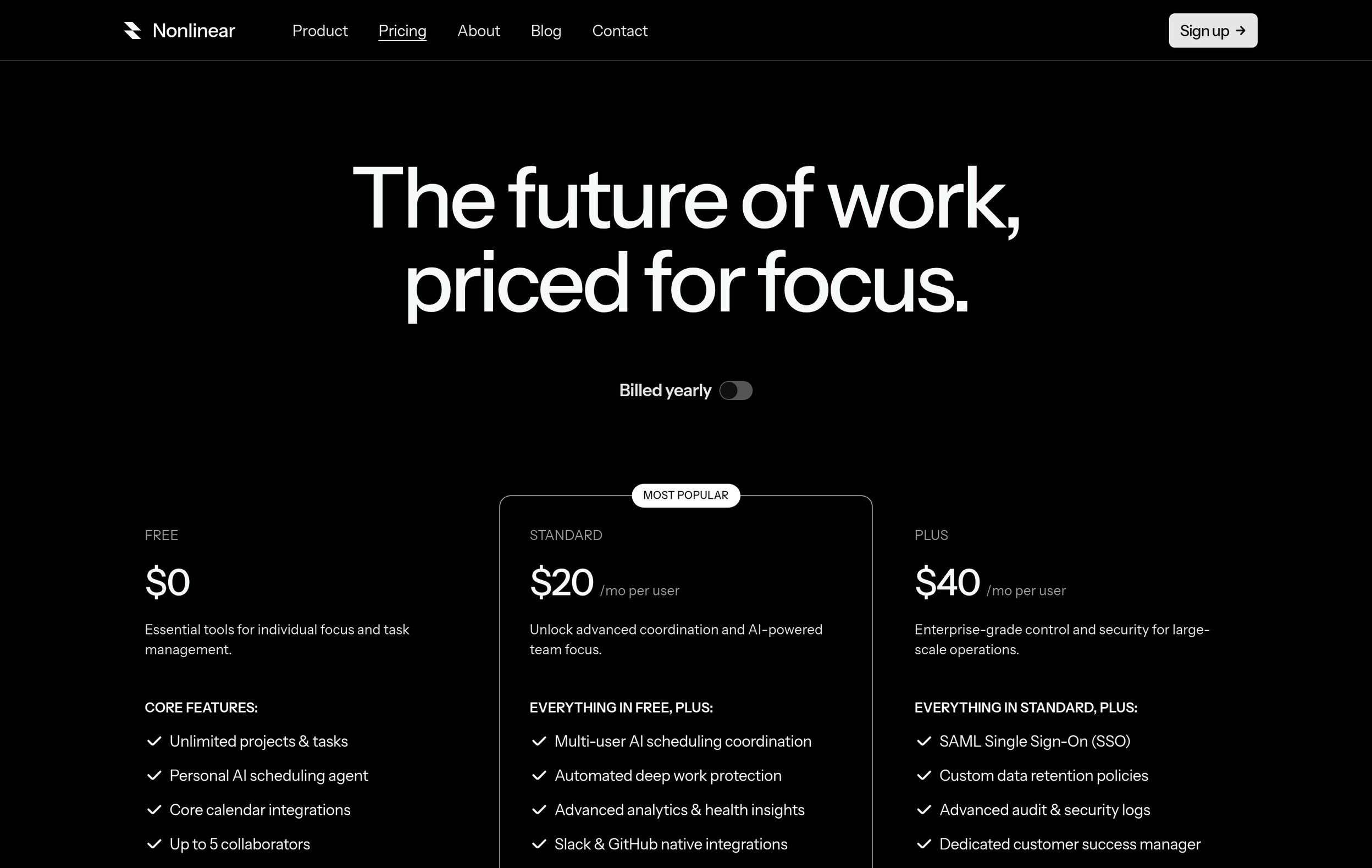
Pricing makes the progression from an individual workspace to team coordination readable. The blog has topic filters and a repeatable editorial layout for product updates, practical advice and customer stories.
The finished site explains Nonlinear through a sequence a visitor can follow: recognize the calendar, see how the working modes connect and choose the level of coordination they need.
The interface stays visible on mobile rather than disappearing behind abstract illustrations, and the editorial system gives the team room to explain new features in context.
Plan, schedule, focus and sync, presented as parts of one workspace.
Paper, FramerFrom the final designs.
“Ilse organized the story around the way a week works. The screens do the explaining, and the page gives each feature a job. It feels connected to the product we are building.”
Other sites and brands from the last year.
Tell me what you’re working on. I reply within two working days.
 WeelumeWeelume: template marketplace