
Creating a music discovery app
A mobile experience that helps people find their next song through mood, lyrics, and visual cues.
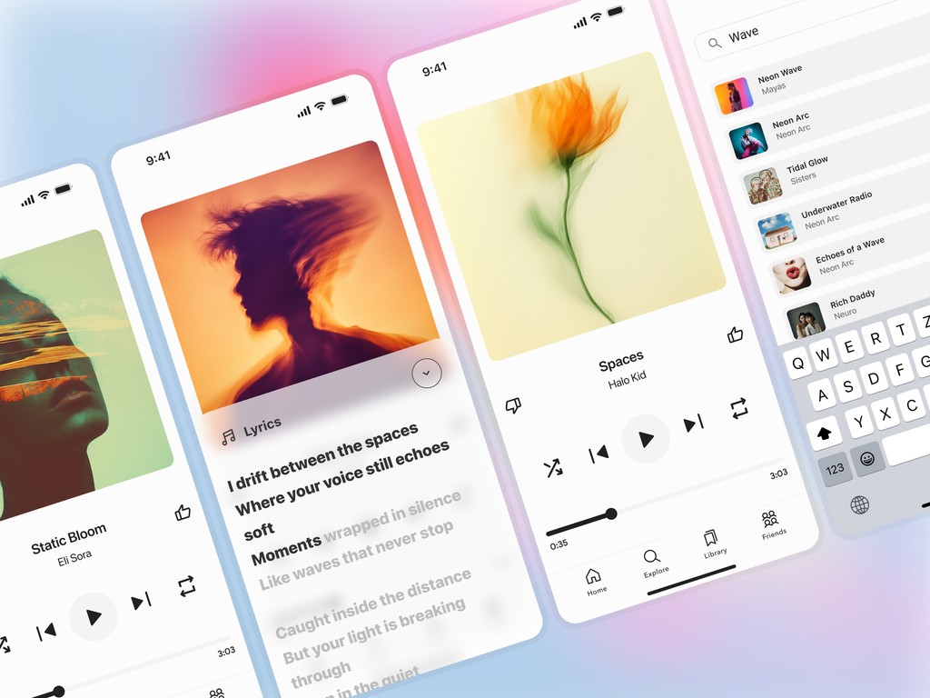
Creating a music discovery app
Aviera is a financial dashboard concept focused on helping small business teams better understand spending activity and everyday financial workflows. The redesign explored how clearer hierarchy, improved transaction visibility, and more structured layouts could reduce friction across the platform.
The Impact
The redesign focused on improving clarity through better hierarchy, cleaner spacing, and more visible transaction details.
Understanding financial activity felt unnecessarily difficult
The existing dashboard contained large amounts of financial data, but weak hierarchy and dense layouts made balances, transactions, and actions harder to interpret during everyday use.
Weak hierarchy
Make the content easier to understand and help people complete tasks faster.
Inconsistent spacing
Make the content easier to understand and help people complete tasks faster.
Workflow friction
Make the content easier to understand and help people complete tasks faster.
Looking beyond the numbers
I reviewed financial workflows and conducted interviews with people regularly managing transactions, balances, and payment activity. The research focused on how users scanned information, interpreted context, and navigated everyday tasks.
“Most of the time, I understood the numbers — I just didn’t understand what needed my attention first.”
5 users
Make the content easier to understand and help people complete tasks faster.
45 minute sessions
Make the content easier to understand and help people complete tasks faster.
3 tasks
Make the content easier to understand and help people complete tasks faster.
Exploring interface directions
I explored multiple layout directions focused on balance visibility, transaction context, and workflow clarity. Each concept tested different approaches to grouping information, simplifying navigation, and helping users scan important details faster.
Focused overview
Make the content easier to understand and help people complete tasks faster.
Modular layouts
Make the content easier to understand and help people complete tasks faster.
Task-oriented flows
Make the content easier to understand and help people complete tasks faster.
Making complex workflows feel clear
The final redesign used stronger hierarchy, predictable layouts, and contextual feedback so balances were easier to compare, actions were easier to find, and activity flows were easier to understand at a glance.
Clearer balance hierarchy
Make the content easier to understand and help people complete tasks faster.
Contextual activity
Make the content easier to understand and help people complete tasks faster.
Simplified navigation
Make the content easier to understand and help people complete tasks faster.
Designing for clarity, confidence, and everyday workflows
This project reinforced how strongly confidence is shaped by interface clarity rather than domain complexity. Small choices in grouping, spacing, and action placement can change how people interpret information and move forward.
Clearer hierarchy
Make the content easier to understand and help people complete tasks faster.
Faster scanning
Make the content easier to understand and help people complete tasks faster.
Scalable system
Make the content easier to understand and help people complete tasks faster.