A tactile identity with a lasting impression
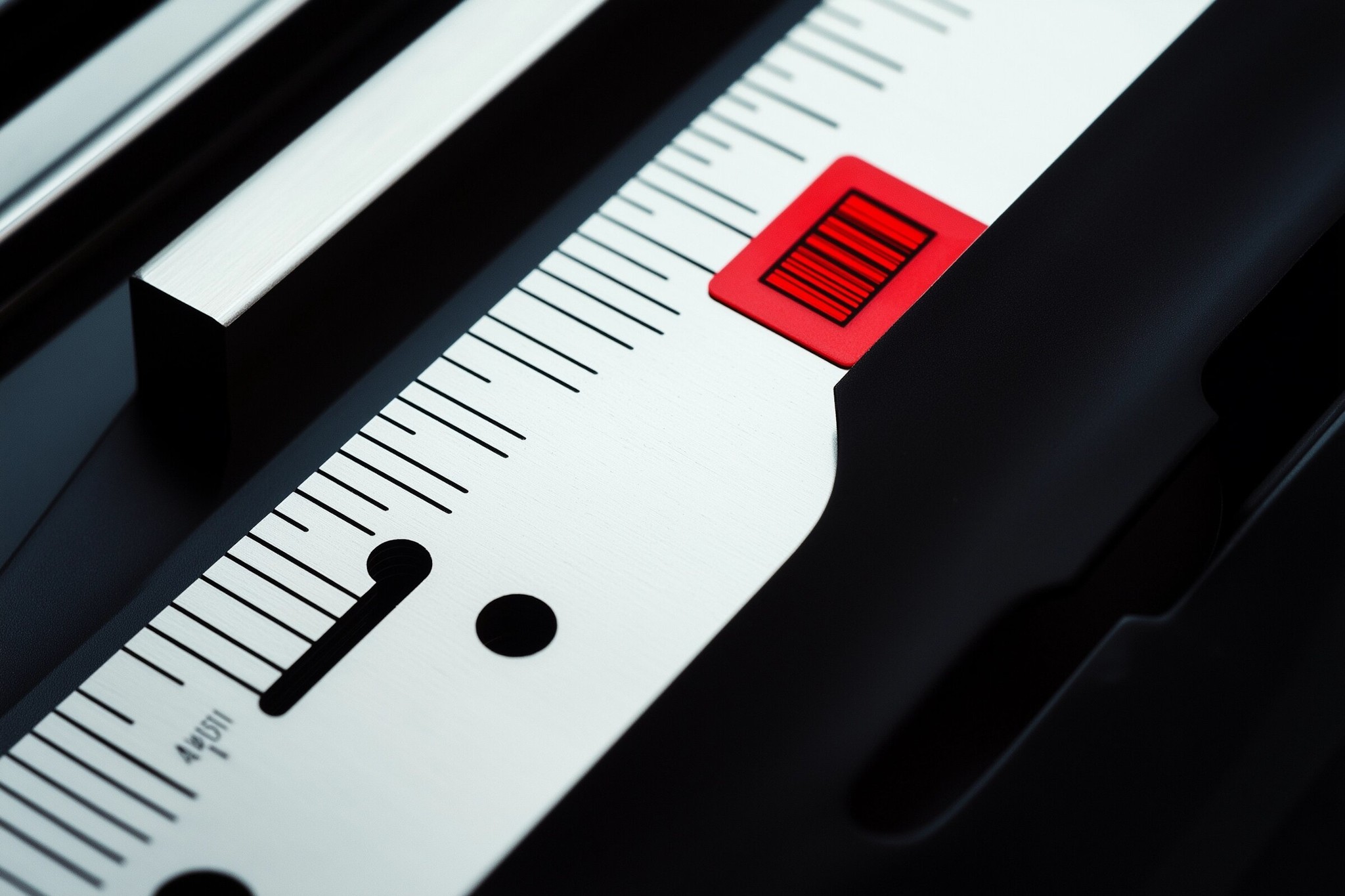
- Industry
- Stationery & Paper
- Timeline
- Q2 2023
- Timeframe
- 8 weeks
Colorado had earned a loyal following for its carefully made paper goods. This concept case explores how a more coherent identity and an inviting digital experience can communicate that same attention to detail.
Concept case studies; not actual Weelume client endorsements.
Revenue growth · illustrative
Traffic growth · illustrative
Find the question That matters most
The existing experience lacked a consistent visual voice. Product discovery needed a clearer path, particularly on smaller screens. The challenge was to express quality without losing the warmth that made the brand approachable.
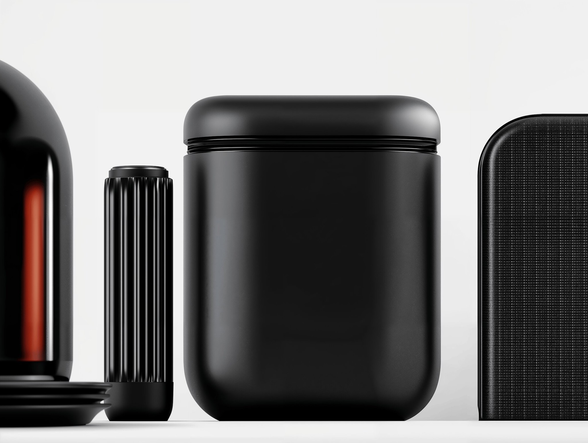
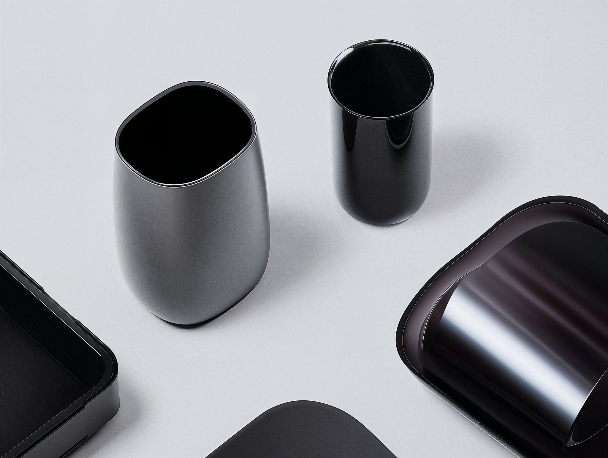
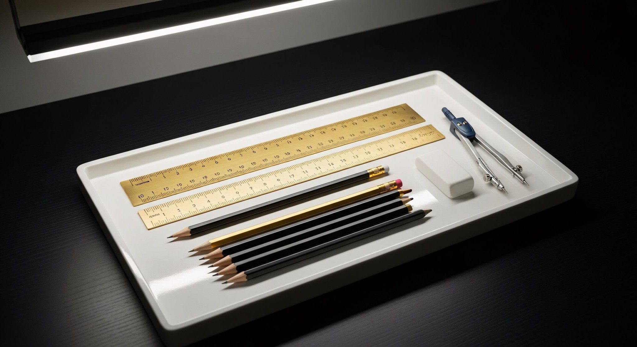
A coherent direction Across the whole experience
A restrained palette, confident typography, and close-up imagery create a tactile visual system. The site connects the story behind each product to a clear browsing journey, with the same care applied to every screen size.
“The new direction gives us a clearer way to share the care behind our products.”
— Sarah Okonkwo · Colorado
More work, different perspectives


Let’s make something worth putting out there
Bring a brief, a question, or the beginning of an idea. We would love to hear what you are thinking about.
