Porcelain Blue
- HEX
- #9EC3D8
- RGB
- 158 195 216
- CMYK
- 27 10 0 15
- HSL
- 202 43% 73%
- Pantone
- 545 C
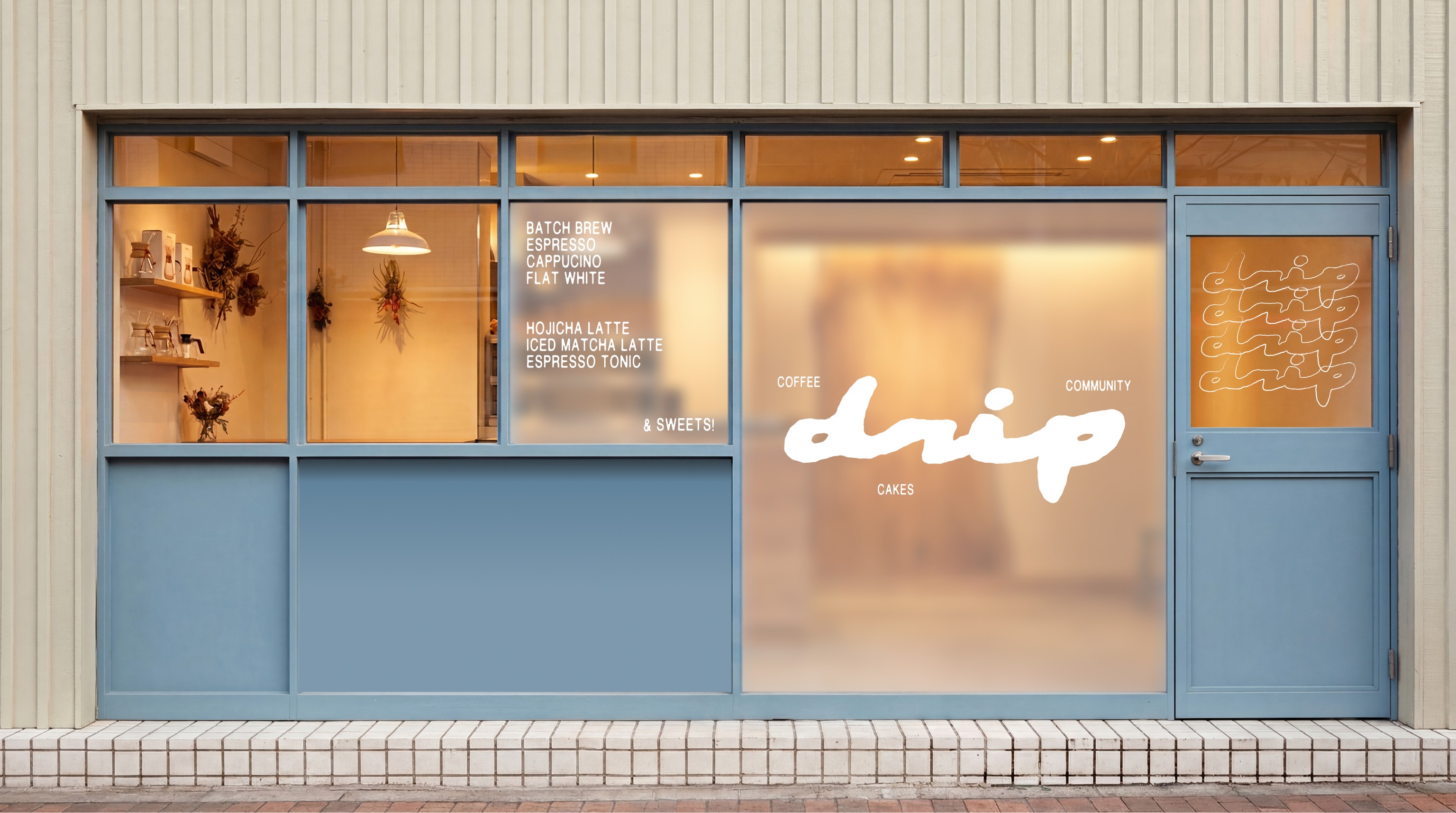
This manual defines the visible language for Drip: a neighbourhood café built around slow mornings, precise coffee, and easy daily rituals.
Last updated: June 2026
Use this index to move through the assets, rules, and production notes that keep Drip consistent across café, print, packaging, and digital touchpoints.
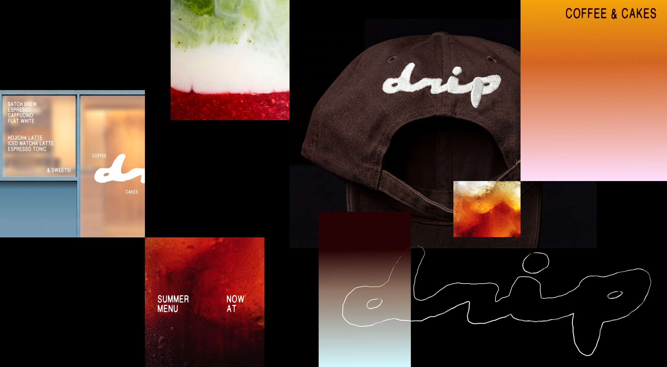
Drip is a café for coffee, smoothies, and small moments of pause. The brand should feel warm, direct, handmade, and quietly confident.
1 Local: made for repeat visits, regular names, and everyday rituals.
2 Sunny: colour and copy should bring light without becoming childish.
3 Easy: every sign, label, and cup should be easy to read and easy to reproduce.
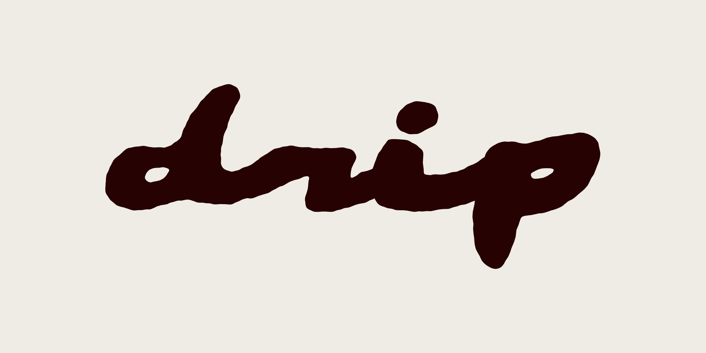
The Drip logo is the primary signature. It should feel loose and human, but it must be applied with disciplined spacing, contrast, and scale.
 MediumSmall
Alternative lock-up of the logo
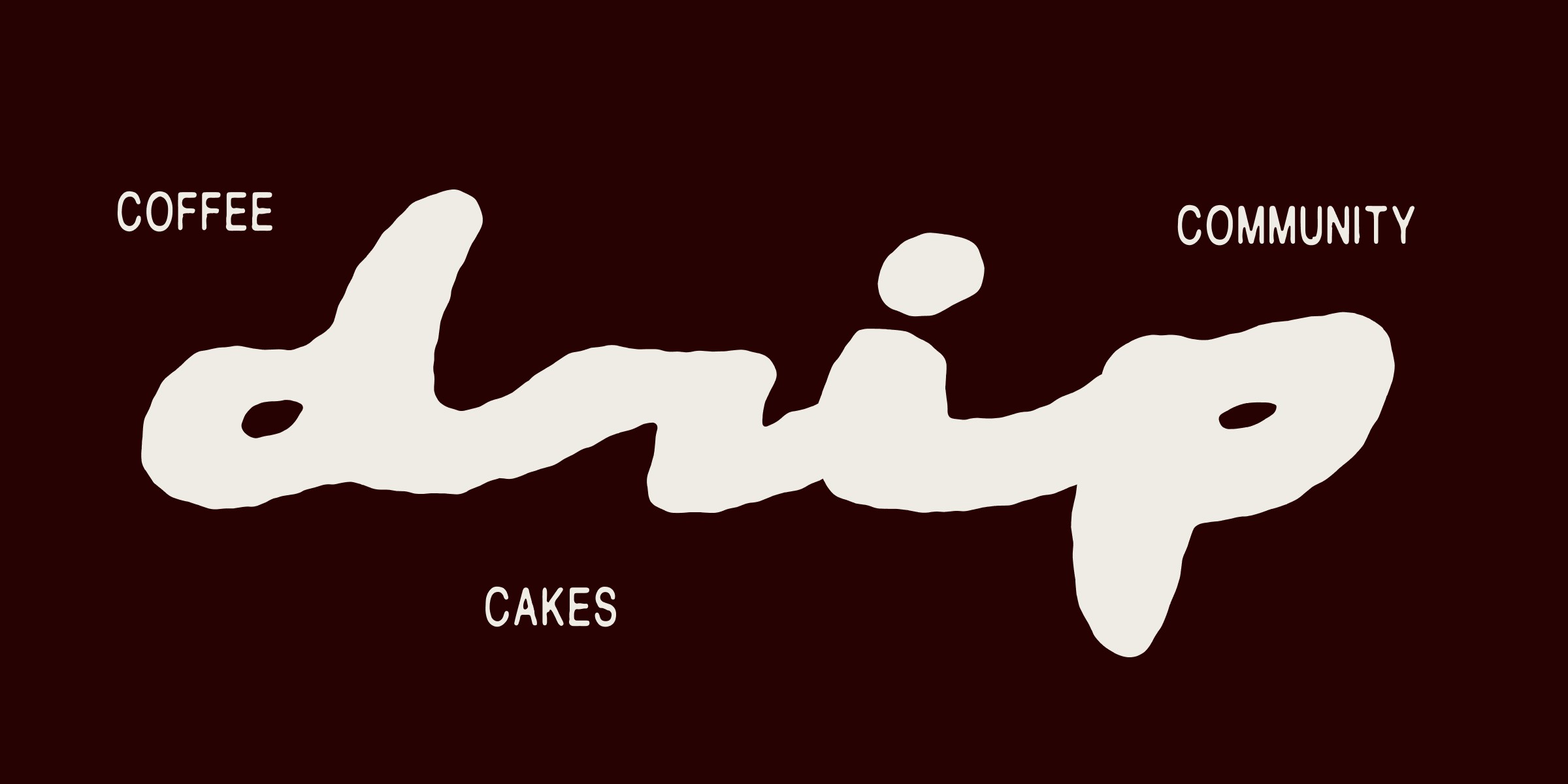
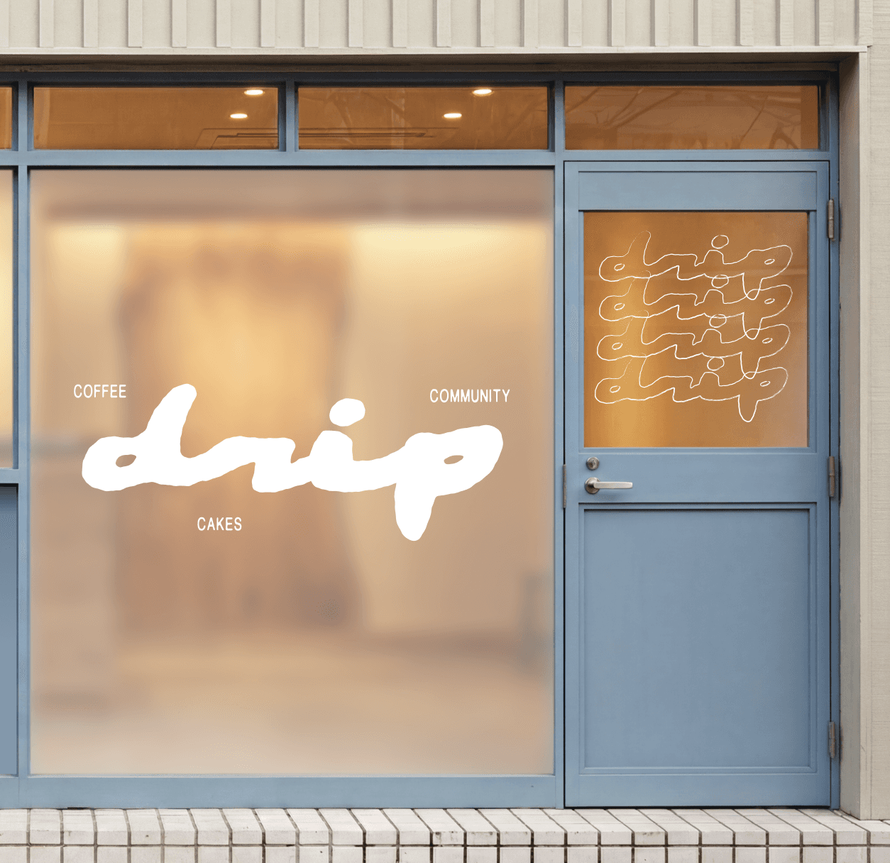
Use the full Drip logo on shopfronts, menus, packaging, and first-contact materials.
Keep the logo white on dark or gradient artwork, and dark maroon or black on pale café materials.
Do not redraw the script, add shadows, stretch the letters, or place it inside a new badge.
The palette carries the café’s atmosphere: milk foam neutrals, powder blue daylight, apricot warmth, and deep espresso-maroon contrast.
The core palette is drawn from café materials: morning light, milk foam, apricot pastry warmth, and espresso depth. Use exact values for print and digital production.
Gradients are atmospheres, made of two blended colours.
RGB 232 147 15 → RGB 232 165 146
RGB 50 16 14 → RGB 168 205 227
RGB 250 241 225 → RGB 98 153 80
RGB 55 24 23 → RGB 255 173 173
Gradients are campaign atmospheres for posters, social stories, menu specials, and seasonal drinks. Keep the logo white and allow generous negative space.
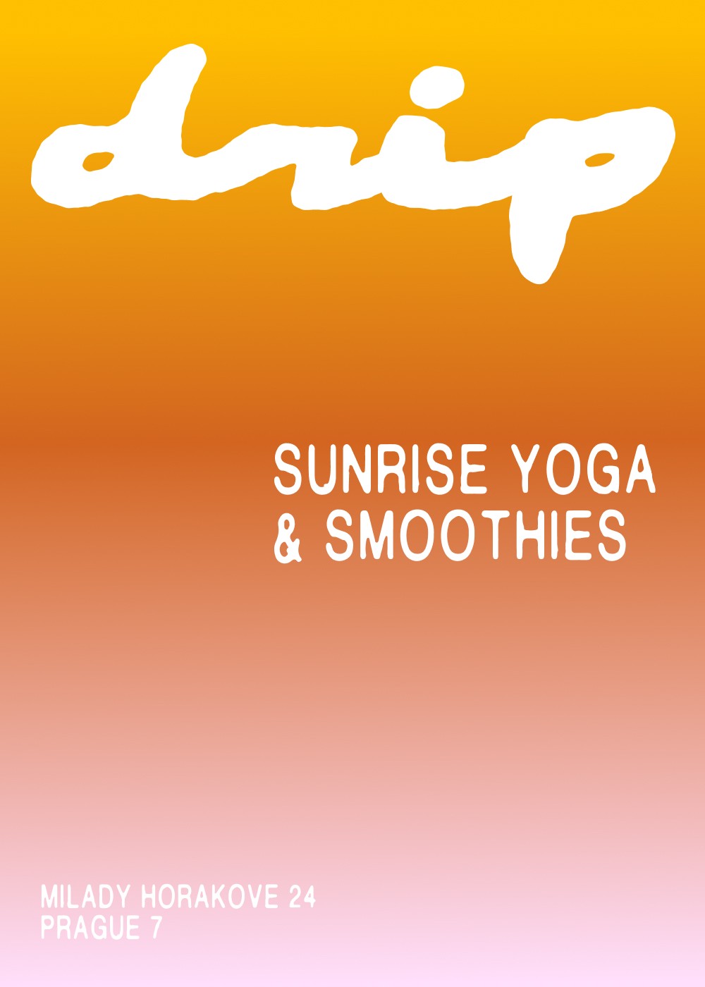
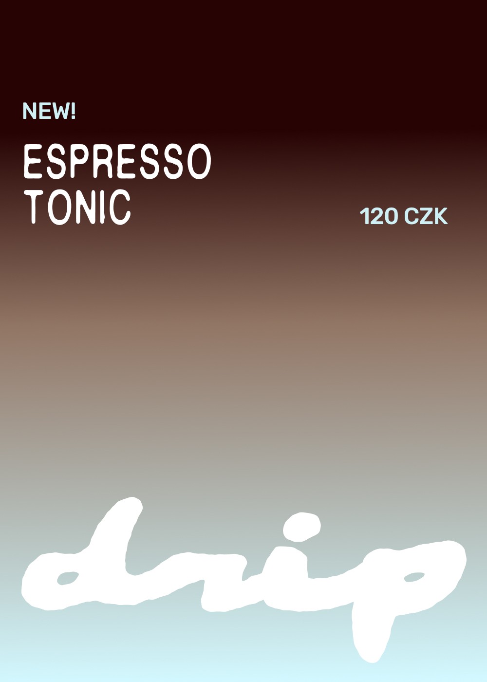
Use warm neutrals as the largest field, brown for contrast and appetite, blue for freshness, and apricot as a soft promotional accent.
HEX and RGB define screen appearance. CMYK and Pantone are production targets for menus, stickers, cups, signage, and packaging; proof before release.
Typography balances café friendliness with a clean manual system. Display type creates appetite; mono notes keep production information exact.
Use display type for drink names, posters, and menu moments that should feel warm and appetising.
Do not mix in extra decorative fonts; the logo already carries the handmade character.
Typography should make menus easy to scan, prices easy to compare, and the Drip voice recognisable at counter distance.
Body copy should sound like a good café host: clear, friendly, specific, and never over-written.
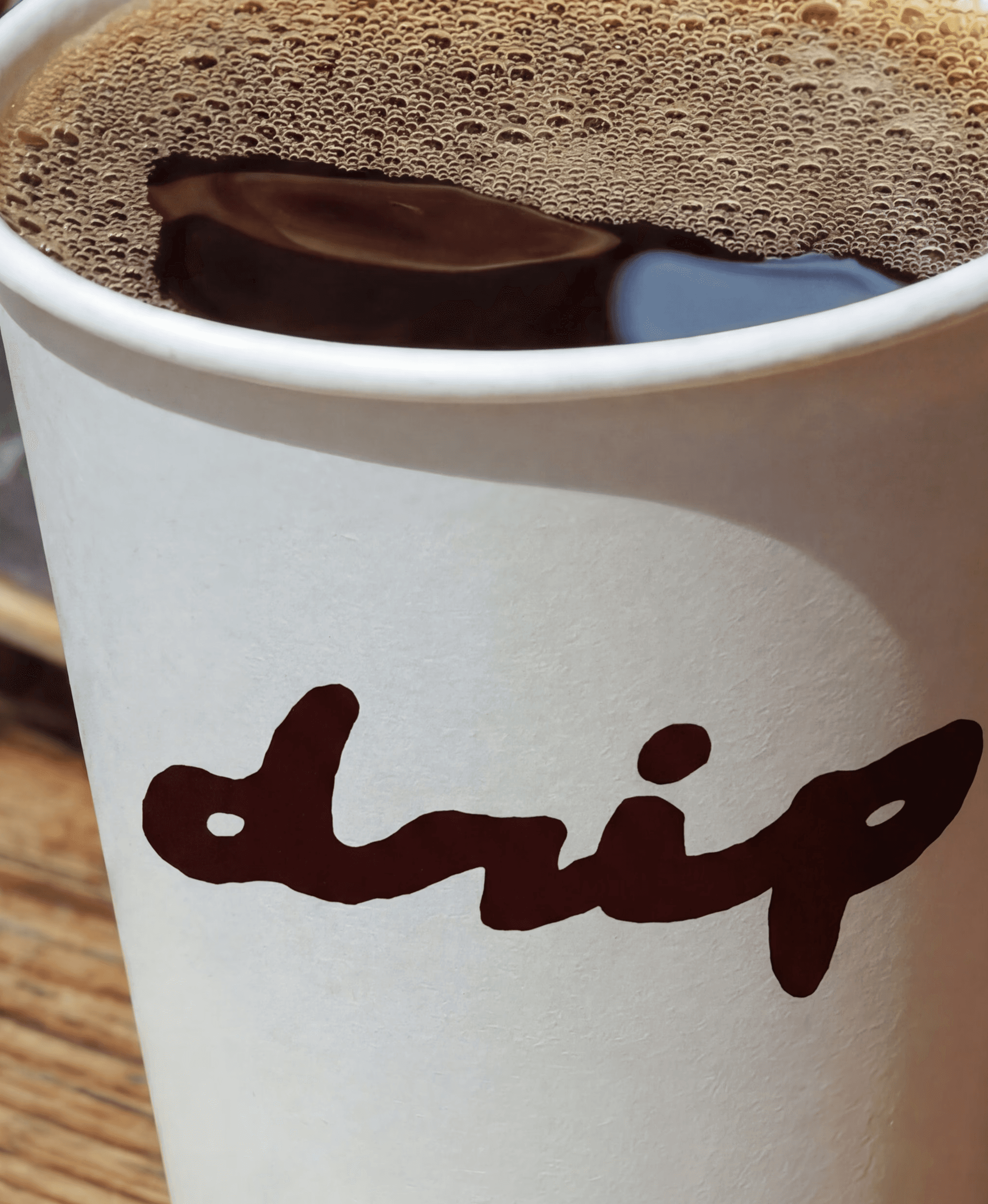
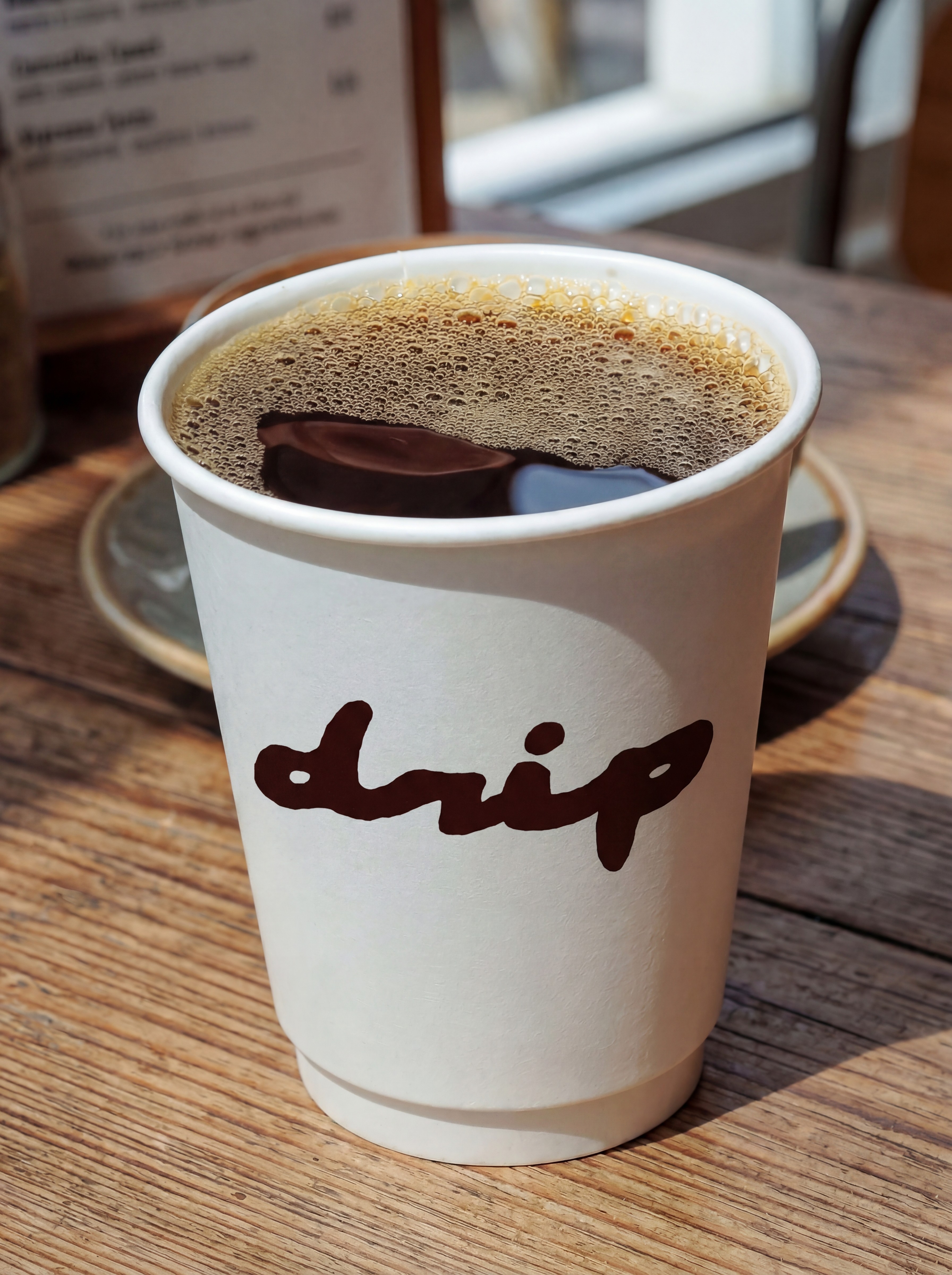
Close-up texture is our key expression. We shoot drinks near enough to read their surface — crema, foam, ice, the layers where one ingredient meets another — so the photograph does the selling before the logo arrives.
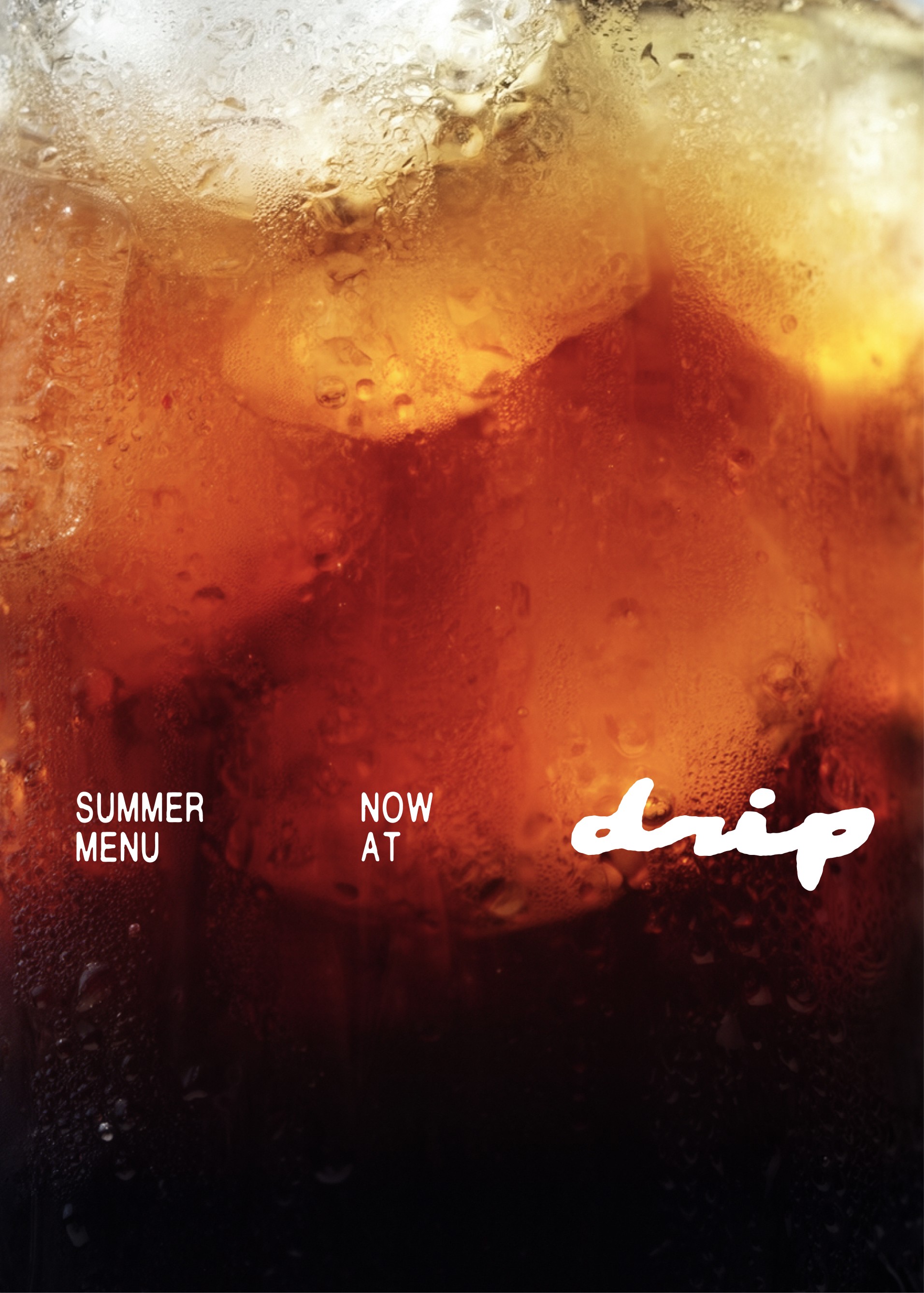
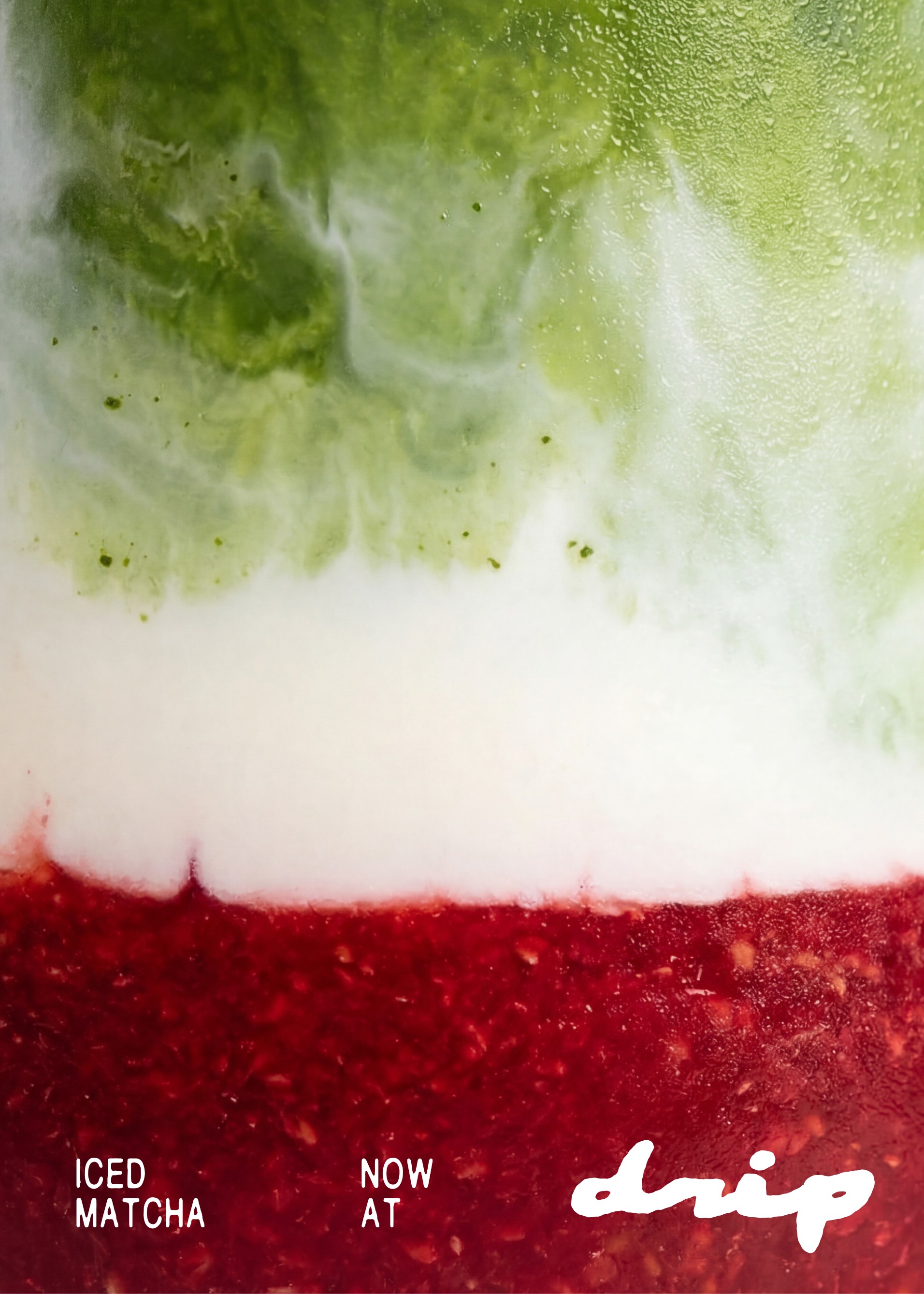
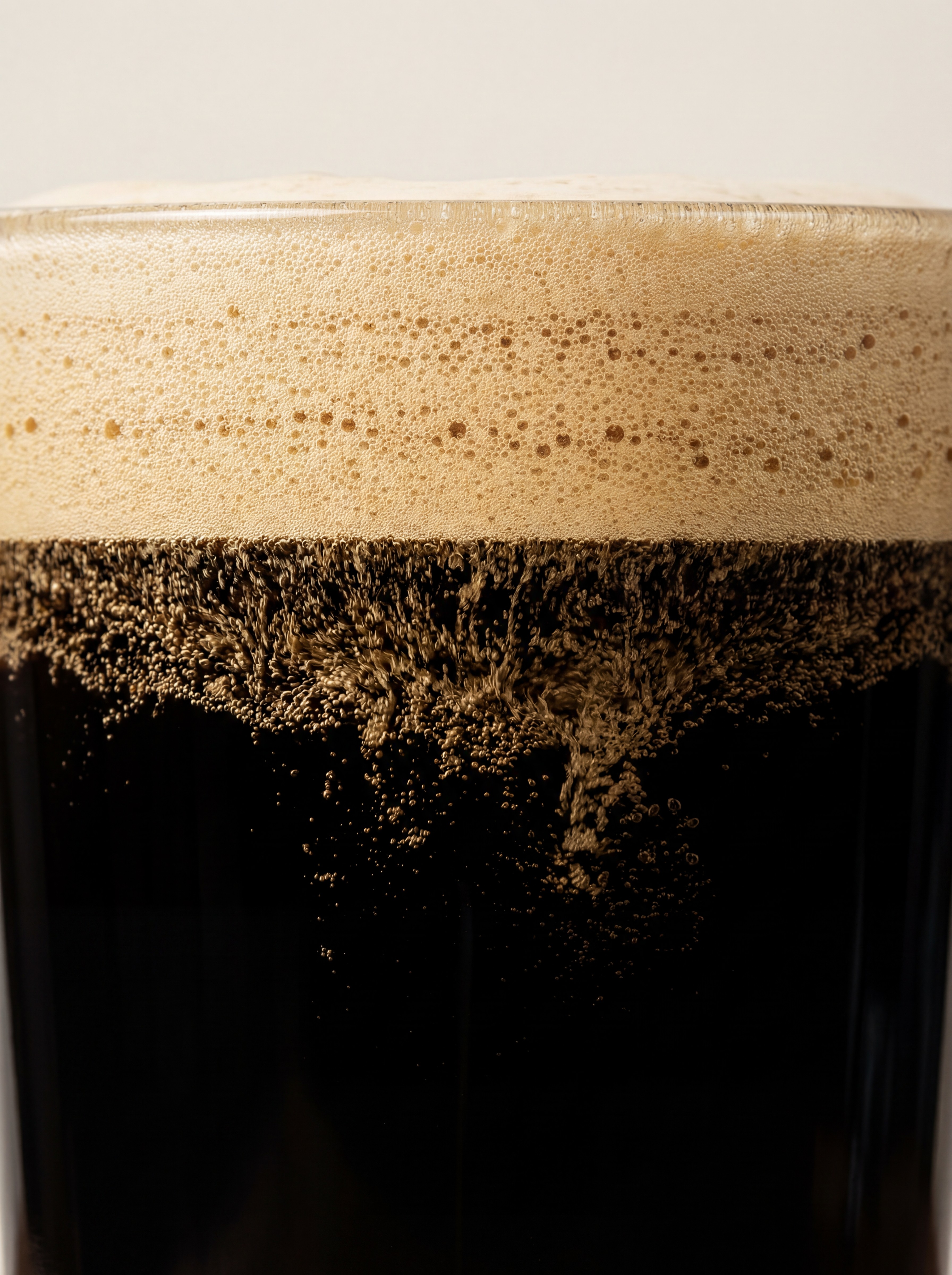
Applications should look practical and lived-in: menus, takeaway cups, window vinyl, posters, product cards, tote bags, and social announcements.
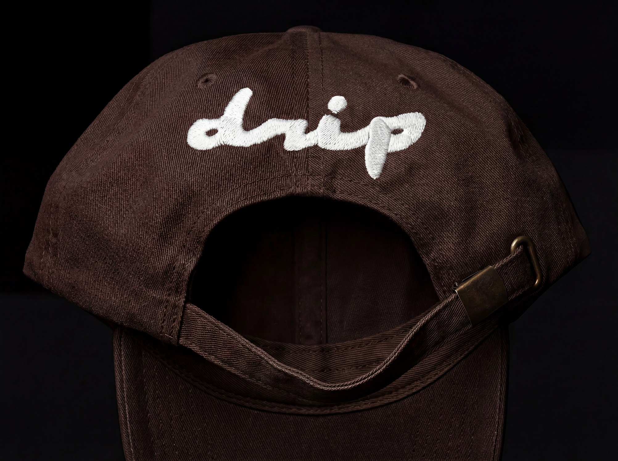
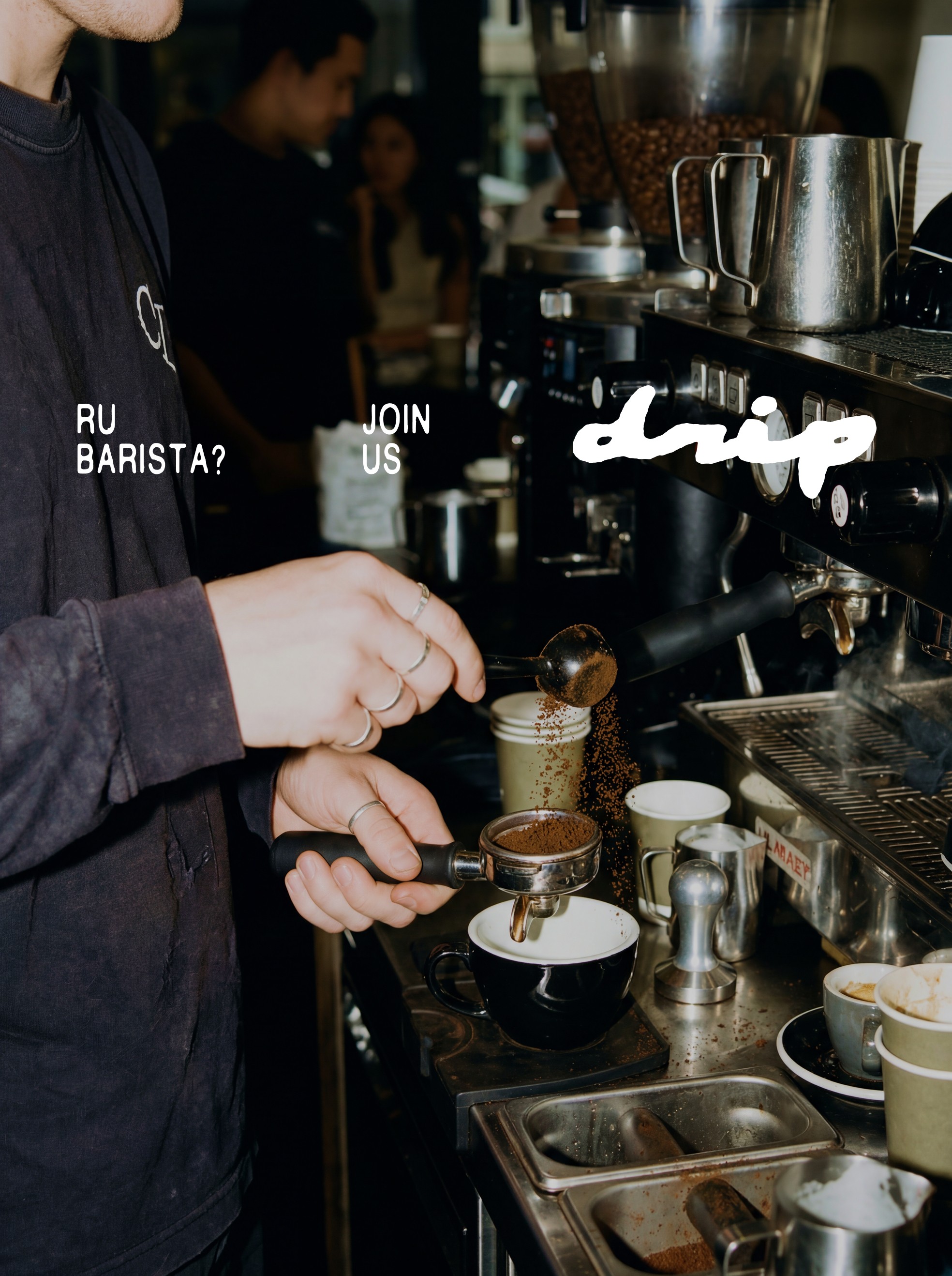
Final asset packages for café teams, printers, and digital partners.
drip-logo-master — ZIP / SVG / PNG
drip-logo-master — ZIP / SVG / PNG
drip-logo-master — PDF
Downloads are demonstrative; no file is downloaded and no external navigation occurs.
Back to cover Weelume